To my readers......

SITE UPDATE NOTICE

Thanks for visiting mitchmen, home of Mitchell's Gay Art

The Caps and Collars/ Flat Cap Gang story at Google Groups has resumed posting. (see Group News for link)

Link to the Royale Studio Archive in the right sidebar


Message updated 9th Feb 2025

Thursday, 7 July 2016

A-Z of Fetish Artists - Bill Ward

 
1

Bill Ward must be ranked amongst the greats of erotic and fetish art and yet his name does not usually spring to mind when that question is asked. He produced a large quantity of work, which most of you will have viewed at some time, enjoyed and been turned on by and yet recalling specific individual images? That's another matter. This one (which I found at Daddyshere) is completely new to me but it's a striking and sexy image and I wonder why it's not better known. Military uniforms often feature in his work.

click to expand images
 2

I started this article with one of Ward's stand-alone pictures but the majority of his work that I am aware of took the form of raunchy, technically innovative comic strips which in the 70's & 80's were published around the world in the new wave of magazines (like Drummer and Zipper) which were pushing open the doors of freedom of expression for those with beyond-vanilla interests. In these stories Ward portrayed intensely masculine and confident gay men who were up for anything, totally at home with their sexuality and determined to freely express it. This little episode (2 above) beautifully epitomises the revolution of gay consciousness conveying a tremendously positive gay image. The highly erotic final frame could form the lead-in to an entire porn movie, it certainly must have prompted thousands of wet fantasies! Ward does not elaborate in that direction. That's a concession to publishing constraints but it gives clear space for his point to be made. 


3

This comic strip picks up the military theme again showing a highly ritualised spanking, whose cause is unexplained until the closing frame when we learn that the hero 'Drum' has been hired to dress up like this and perform the punishment ritual for the voyeuristic, weedy-looking but wealthy man who is the owner of the lush surroundings. This unexpected twist is typical of Ward's work and sidesteps awkward questions about motivation and intent by deflecting them back to a member of the political establishment in an enjoyable flash of satire. The object of the punishment in this story is only shown in sketchy outline and his presence, paid or otherwise, is not explained. It lends an unreal, dreamlike quality to the scene, which is another helpful device for avoiding legal objections, however it does dilute the eroticism.

There's a tremendous dynamic energy in the way this episode is portrayed in a series of memorable frames. They interact visually in a complex way which is typical of modern comic art. It requires a degree of concentration to take it all in, but is all the more rewarding for that effort. You'd think that these dramatic images would stand up separately by themselves but look at the example below.


 4
Shorn of it's context (admittedly with crude digital surgery) the individual frame proves to unexpectedly simple and is visibly incomplete. The impression of a luxurious mansion and frantic action disappears. That is a tribute to Ward's artistic skill in assembling his comic pages, making them add up to more than the sum of their parts.

It's interesting to contrast this little story with Tom of Finland's 'Sightseeing the Guards' (Kake No 13) which on the surface has similar erotic ingredients. Tom's gay hero is punished by the soldiers after admiring them in their uniforms, teasing them and taking compromising photographs. His open gayness inflames the Guard's fear of exposure and blackmail. That he (and they) enjoy his subsequent homo-erotic punishment (in a suitably discreet dungeon out of sight of public view) is a rationalisation which is mildly subversive but also speaks volumes about social norms. In Ward's story however, the gay hero steps into the uniform and takes control of the punishment, even getting paid for it. The role played by his paymaster arguably demonstrates that fear of exposure never goes away for some gay men. 
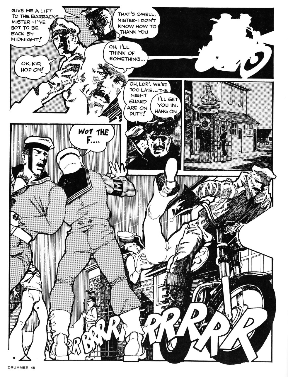
 
5
Ward's skill in creating exciting, almost cinematic scenes is nicely illustrated by this page from a 'King' story, which is self explanatory. I love the drawing of the sailors in the bottom frame which has an authenticity and sexiness which recaptures the lusty joy of the Royale and Guys in Uniform Studios photos of the 50's and 70's (* see footnote). It makes me yearn to see what he might have done if he'd been able to give his erotic imagination full rein. The essential Britishness of Ward's work is plain to see in both the imagery and the language (although a Brit would never say 'swell', nor 'fag' for that matter as quoted in example 2 above – I assume the American publishers have replaced the original words which were probably 'great' and 'queer' respectively). Once through the gates King loses his hitcher but goes on to make hay in the Sailor's dorm (behind discreetly closed doors of course).
 
6

King is quite a neat leatherman but Drum's appearance in his cartoons is mature, slightly dishevelled, hairy, with torn and tattered clothing worn for sexual appeal rather than style. It gives him that 'real man' aura belonging to the bear/leather scene. Even so there's a degree of artifice in it all, the cut-offs worn here are a 70's fashion statement and consider the areas of flesh visible (but not shaded by Ward for some reason) through tears and gaps between his garments. 

If you review the images I've selected you'll also find plenty of clean cut, youthful types lurking in the background (as here) and they are not infrequently the object of the hero's desire when he wants to play the active role (e.g. the sailors in the example above). This aspect of Ward's art perhaps explains the the unexpected phenomenon of 'Zeke'.

 
7
The staple diet of many gay comics around this time was the cute, naïve youth going from one gay adventure to another, aware of his sexuality but not his allure and frequently used by other men who can't believe their luck in getting their hands on him (e.g. Billy in 'Poppers' by Jerry Mills, Bruce by Jonathan). Ward produced something similar in the form of Zeke, the well-built but inexperienced country boy who goes to the big city and is duly exploited without even realising it. In his pictures Ward links that clumsy innocence with a youthfully butch appearance which will clearly evolve into prime leather scene material in due course. Zeke had a short run and seems to have been an isolated experiment by Ward who still put his humour to use with his more mature heroes.

8

There's a glimpse of Ward's true capabilities in the 'Man Bull' storyline which utilises the dream device (or an unstated drug causation) to conjure up a mythological man-beast who subjects the hero to his lusts. Beastly involvement in sexual matters is dangerous territory for Brits, but there's a well-established tradition in descriptive arts for using such hybrid creatures to express the nature of male sexual desire - from Updike and Picasso (pungently) back to the Renaissance masters (more delicately). Ward's imposing invocation more than does justice to that tradition in a terrific full page image that delicately tip-toes through the legal minefield of explicitness with an ambiguous sun-ray effect.


9

In the follow-up scene Drum is subjected to a spectacular, spread-eagled suspension by the beast whose intentions seem surprisingly fetishistic and outspoken for a 1977 top shelf* magazine. Probably most of the general population would have assumed the fist was to be used for punching and not known about fisting. Ward's accompanying picture is cleverly ambiguous.

As a measure of Ward's ambition here, this story is contemporary with Tom of Finland's Kake No 20 'Pleasure Park' which features nothing more provocative than multiple sex in a public place between clean cut, conventional gay stereotypes.

*magazines in the UK at this time were only sold in Newsagents shops, alongside tobacco and sweets. The naughty stuff had to be placed on the top shelf of the display, out of reach of young hands.

10

As the story proceeds, Ward goes on to show a more explicit sexual interaction with the beast (including penetration) but it's jumbled-up detail in an eye-grabbing image and heavily disguised. Just in case it is spotted, it is deliberately placed in the most unsubtle way imaginable so as to be seen as a product of Drum's brain, a mere thought, a fantasy. Ward may have succeeded in sneaking provocative material past disapproving eyes, but the unplanned consequence is that the erotic impact is largely lost. Moreover Drum seems to loose his essential masculine earthiness in this picture, it's overwhelmed by the (impressive) techniques invoked to suggest his unreal state of mind.

Perhaps it's not altogether surprising that our recollection of these works is as ethereal as the way Ward sometimes drew them. His work is visually complex and does not deliver instant gratification but it requires closer study for full appreciation which is worth it for anyone who likes fetish art, probably more than most of the artists I showcase here.

As far as I know there is no official Bill Ward site although an intermittent attempt is being made to set one up at Bill Ward Archive. There's lots of his work available via search engines and a decent collection at Ward at Daddyshere

Recently (2019) a new article has appeared at Guy Burch with a brief biography (including his early days as 'Titan' and 'Tristano') and describing how some of the artist's work was rescued from destruction following his demise.

For more articles in this series click on the A-Z label below or search for specific artists using the index page or search boxes (top right)

  *click on GIU/Royale label below for full list of their work published here

Monday, 6 June 2016

Wait just a minute!

Pic Courtesy of Kings Cross Steelers

Mitchell is away on a break until the end of June

Wednesday, 1 June 2016

A-Z of Fetish Artists - DF Ward

1
Today's artist is one whose work you may have seen in spanking collections without being aware of his name. I have seen some of these images listed as being by 'Johnson' but I don't know if that moniker has any truth behind it.  This one showing a man being held down on a bed and subjected to a severe belting is quite well known. One is immediately struck by the angular, serious faces and somewhat scrawny-looking limbs which suggest realism rather than idealisation was the objective. This is the exercise of power and control rather than mutual pleasure, a stance which to some extent may be accounted for by the censorship restraints of it's time - the luxuriant hair styles position this piece around the 1960's. The parallel lines method of shading of the muscles is also typical of this time, you will see it in early 'Superman' comics.

2
Humiliation and punishment is the name of the game in this piece too. The younger man is no boy but he's being caned in the nude for some misdemeanour by an older father-figure type whom the artist has characterised as old, unattractive and slovenly. It's a case of 'you may not like me but I'm the boss'.


3
 The idea of a punisher whose power does not derive from his own personality is encapsulated here. The fascist-style uniform is not intended to make the him attractive, just more powerful. His lean build and awkward pose conjure up a sense of doubtful motives too. There's an intensity to the thrashing and the victim's pain which is quite stark and uncomfortable, but this time there is a mild suggestion of eroticism in his hitched-up shorts and revealing projection.

 4
 In this example the artist seems to come out of the closet and shows us the punishers seeking enjoyment, but if you look at the enlarged image you can see that every penis  has been clumsily added by someone else and the paddle-wielding character in the background barely seems male.
The angle of the table victim's head has been changed too (look at his ear area).
Only the lowered trousers in the foreground  have a degree of authenticity,
 admitting sexual pleasure as an element in the picture.

 5
I find this final image intriguing not least because it chimes with the part played by the fire in my Christmas Criminal series. The brightness (and heat) of the fire which would normally radiate out in every direction is shown as focused downwards on the victim's upturned ass. This shows no signs of having been spanked, suggesting this might be a tenderising prelude for him (as in Christmas Criminal). The inclusion of a hole and pucker looks original and makes this a homo-erotic pose in anybody's language but there has been some tampering in this area. The seams of the planking just to the left are not continuous with those on the right and you can see a couple of vertical joins where something has been pasted in. The strange chunky device attached to his cock actually looks a bit like a hand on close inspection and further afield the knot-holes in the floor in front of the fire are clearly replicated. The alterations around the captive's body have been quite skilfully disguised but this image is not a very useful guide to Ward's art.

~

The majority of Ward's work actually involves both sexes with the women drawn as voluptuous, scantily-dressed creatures who may either be monstrous amazons dominating their down-trodden men or alluring fruit ripe for plucking as in this link:-  Ward's male-female imagery. There's no doubt about erotic intentions in these pictures and funnily enough, his men seem to acquire more masculinity and attractiveness in these images. 

However this hetero-predilection and the evidence of tampering in some of these pictures makes you wonder about the authenticity of all of them. The mysterious hand in picture 5 could easily be a woman's. In picture 4, there's a figure wielding a spanking paddle in the background, but take away the penis and is it really a man? Is the person on the table a man either with that bottom? 

In picture 2, the composition is oddly unbalanced and there is a blank area above the victim's back. It's obviously a double bed, you can see two pillow corners just by his right hand, but the further pillow is incomplete. I suspect that there's a lady that has been edited out of this picture and it's her father administering the punishment. This also explains the young man's nudity, caught in the act!.

It's easy to find Ward's pictures on-line via search engines and a few of them are genuine man on man action but you may find the lack of erotic commitment in these examples limits your pleasure. 
You can also find articles but I haven't found a definitive source for him.

For more articles in this series click on the A-Z label below or search for specific artists using the index page or search boxes (top right)

Saturday, 28 May 2016

A-Z of Fetish Artists - Waldo

Waldo - Fenced
This French artist's work is focussed on spanking, drawn and painted with fresh colours in a comic book style with a slightly retro-feel not unlike that used by Nikolaas for his rather darker subject matter. The clothing likewise reflects it's time but I like the traditional shorts suggesting a jogger on his morning run taking a short cut where he shouldn't!

Waldo - Cellar Time

If you enlarge this image you will see that this man's face has a classical quality like the statues of Greek and Roman antiquity and it shares the rather lifeless eyes that often characterise those works. You don't get a strong sense of personality or that this artist admires men or sees them as powerful, sensual or sexual objects. I'd be a bit worried about what's going to happen to the plumbing if the spanker really gets going!
 
Waldo - Belt Loop
 
This is a very simple image but captures rather skillfully the curve of the belt as it circles round the the subject's body and cock. The indentations produced in both areas show a tight, restraining fit. I'm not sure this arrangement is achieveable with a conventional belt design though! 
.
The majority of this artist's work features female participants as both tops and bottoms. If you are not averse to such content you will find plenty of it very easily with search engines.

 For more articles in this series click on the A-Z label below or search for specific artists using the index page or search boxes (top right)

Wednesday, 11 May 2016

A-Z of Fetish Artists - Waistband

 Waistband - Y-Front Fantasy

Waistband - Ass Worship

Two images by an artist I know only as 'Waistband' and involving the worship of traditional white men's underwear. Many of us cut our teeth on gear like this, advertised in store catalogues. Functional underwear that isn't pretending to be anything else and is not meant to be seen makes the wearer look particularly undressed whenever it does see the light of day. 

There's memories of the famous Y-Front marque in the first picture although I can't recall ever seeing variants with a button fly like that depicted here. The second image portrays something more like the Calvin Klein revival style. Both varieties provide the glorious rear view that only comes with a modest capacious fit and high waist. This inbuilt characteristic of modesty makes the man who wears it all the more challenging and intriguing and sightings of him in his underwear acquire a rarity value.

This artist has his own distinctive 'woodcut' style that gives these images credibility. If anyone can supply more information about him (via comments) I'd be glad to hear from you.

If you like looking at men in this style of underwear have a look at my series 'In Praise of Y-Fronts'

 
For more articles in this series click on the A-Z label below or search for specific artists using the index page or search boxes (top right)

Friday, 6 May 2016

A-Z of Fetish Artists - Waelon


Randy Waelon produced extraordinary pictures in the 90’s showing deadly conflicts and tortures involving knives, spears, arrows, stakes and similar pre-industrial weaponry. Most of it is too extreme for this blog although it would pass without comment in a Hollywood film.


This chariot example is one of his milder images conjuring up a fantasy of primitive enslavement. His characters exhibit lean muscularity and distinct but varied ethnicities which are well-observed and without any hint of caricature. Are these two hapless explorers who have fallen into the hands of some secret group with their own unique customs and values? This type of storyline gets a bad press because of its mistaken assignment to certain parts of the ‘undeveloped’ world. We all know that real life ‘lost tribes’ seem to be peaceful and friendly to point of naivety. But the theme of encountering the possibly hostile unknown has a universal significance and these days it’s more likely to re-appear dressed up in post-holocaust trappings. It works fine as an allegory of entering gay life and other unpredictable ‘social worlds’.

 
Waelon drew a notable set of images showing similar tribesmen in a jungle setting, dressed only in loincloths and meeting gruesome ends in battle or captivity. 
The absence of any overt eroticism in these pictures places them in a distinct category which arguably has nothing to do with fetish at all, but who can fathom the human mind?


His output is not restricted to such Tarzanesque fantasies; there are examples of modern settings and black ethnicity too, which is depicted above with an uncompromising but inoffensive authenticity and authority that only an insider could carry off. This is a detail of a larger picture.

Stylistically Waelon has the skills of a professional illustrator and the attention to detail (like the neck of the captive above) shows a preoccupation with realism that goes beyond, in fact goes against, the normal requirements of erotica. 

I can’t find any reference to him on the web and the challenging nature of his imagery means that public postings don’t stay around long , you may track him down in membership groups like GMBA (see sidebar).

Tuesday, 3 May 2016

More Than It Seems


This stylish image by Wally Rainbow mades an interesting prelude to the letter 'W' in my A-Z of Fetish Artists which is starting soon. The artist is a prolific producer of romantic cartoon art but this image is a bit more interesting than that. For a start the main character is quite a nice representative of manhood (a depiction which reflects the Italian background of the artist). There's also an obvious fetish element (domination and whipping) even if, like me, you're not interested in little blue men. 

But this image has an additional appeal that is quite hard to define at first. The theme of a man carrying a demon on his shoulders who constantly punishes him has a distinguished and pretty much universal literary ancestry. Wikipaedia calls it the shoulder demon it pops up in Japanese legends and modern fantasy fiction where goblins abound. You don't have to be a psychologist to recognise the significance of the symbolism and it's relevance to personalities you know, the expression 'driven' seems most apt in this context.   

Seeing the demon with a whip in his hand also makes me wonder if this offers an insight into the origins of our own interests in S&M, but it's a bit early in the day to explore this idea!


Wally Rainbow has a blog called Lightelf which covers other atists work as well as his own.