
An eye catching cover from a 'Commando Picture Library' comic showing the crew of a Japanese submarine in an unexpectedly interesting light. It's hard to believe that they would handle that oily gun in their best whites but they certainly show the gunner's shapely bottom to good effect. A splendid use of artistic licence from a mitchmen point of view!
More curious is the star effect created by the creases in his trousers emanating from the crotch area, which seem to suggest rays of light are shining out. The gun-loader in the foreground seems mesmerised by it, which might explain why he's pointing that phallic shell in the wrong direction altogether if he wants to get it into the gun. The loader man isn't actually the 'him' mentioned in the title of this story, but you could imagine it applying to him here. It's a funny life in the confines of a submarine.
Is this another gay artist subversively expressing himself? After all (as I have been known to say in the past), he didn't have to depict the scene quite like this. There's definitely a smoking gun here!

Leyendecker - These Men Have Come Across!
Even if you have never been in the Navy, as a gay man you probably will have got a better idea of how one loads a big gun, from the well-known, homoerotic, US Navy images of FX Leyendecker. Even his shell seems to be momentarily aimed in a perversely erotic direction, rather than the open breech slightly to the left - 'open breech' there's an expression to conjure with!
Take your pick of possible targets, choose between (another) shapely bottom, alluringly clad in lace-up, white trousers or, alternatively, the crotch of the gunner in between them whose startled pose (a 'recoil' I believe is the technical term) suddenly becomes even more expressive. Even his hands seem to trying to tell us something, or is that my imagination running riot?
The title of this image is taken from a recruiting poster on which it was used, part of a long history of naively inappropriate Navy Recruiting, older readers will remember the 'Village People' campaign.
.

This young gunner does seem to have the right idea where he's going. This image (by Leyendecker's older brother Joe) also illustrates another rule for aspiring gunners - the importance of stripping off your top in the heat of a close encounter, especially when handling objects that are liable to explode.
This man's bottom, being centre-stage, is necessarily more modestly modelled than the images above, but you sense the man's sweat is making them more than a little clammy and it doesn't look like he's got much on underneath. You'll notice his companion discreetly averts his eyes. Actually, the lighting and sensuous shaping of his face and his cheeky cap is a homoerotic delight that must have influenced more than one man to opt for a life on the ocean waves.

It's probably not in regulations to strip off to this degree though! This image is in the style of McClelland Barclay who assumed Leyendecker's mantle in the WW2 era, but I doubt the explicit element is his. His sailors considerably exceed Leyendecker's in heroic muscularity and patriotic determination, you just know that his piece is going to be rammed firmly home. Masculinity oozes out of this image and it's recruiting power rises accordingly amongst all men who prize that element of their identity, not just their gay admirers!
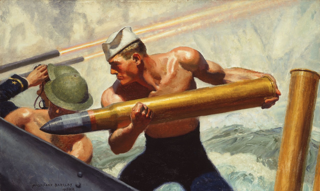
McClelland-Barclay - Man The Guns
It's the same message here but arguably more emphatic. The swirling waves and gun-fire in the background help to create a great sense of drama and confusion in the heat of battle and that shell looks really heavy. You sense the man readying himself to thrust it into the breech.
The ambiguous title is from a recruiting poster again, arguably it's just the product of a more innocent era. You will observe less naivety in the lower body area however, it is noticeably blurry, even the leg outlines are much less crisp than, say, the uniform, cuff detail on the far left. Some crotch creasing is visible if you expand the image, but I think there's been some censorship here.

If the previous image seems to convey 'readiness' there's a more active forward momentum in this rather satisfying reverse composition, it's generated largely by the repeated upward sloping diagonals and the sailor's open legged stance which coveys strength and solid grounding.
For lurkers, the trouser detail of this picture has also suffered in the copying, but you get a better idea of what the artist wanted you to see. He doesn't just show the shapely, muscled cheeks of this man, he cleverly uses the shadowing to cloak, but still hint at alluring, unseen depths. He also clearly understands the erotic nature of the back-lacing in these uniforms, just as Leyendecker did (with a slightly different viewpoint) in the images above. The dart provides a visual substitute for the cleavage a naked man would show, but the triangular shape has been exaggerated, suggesting bulk and forming an unmissable, downward pointing arrow.

The phallic implications of inserting pointed shells into cylindrical holes don't entirely explain the homoerotic appeal of images showing half-naked servicemen grappling with guns. Working together with other half-naked men must have something to do with it too! This picture seems to illustrate that, note the eye contact between these comrades. I think this picture is also by McLelland Barclay, he usually signed his pictures in the corner but it's entirely possible that it's been cropped off, together with a potentially, interesting piece of anatomy on the right hand side of the picture.

Here's the real thing. Sadly, the over-exposure means we can't see the interesting detail, just a glimpse of chunky bottom second left. The term 'Battleship' suggests the mid 20th Century. It's quite a sizeable team, the opposite end of the scale to the recruiting images of Barclay which seemed to suggest working the gun could be a one man effort! The fact that the gunners really are all stripped to the waist might make this an even more persuasive invitation to would-be matelots. Especially as the shell they are all helping to load (centre) looks quite puny. Battleship guns were usually 16"diameter, this shell looks a tad smaller and hardly needing all those hunky attendants to work their socks off.

This is a better but older image, pre-World War I and although it's staged it has an authentic air about it with trousers clinging to sweaty bodies. The old Royale Studio sailor models famously had their trousers soaked in water (while they were still wearing them, on occasion) in order to get a clingy revealing effect. Perhaps I've been wrong all these years, thinking they only did it to get sexy lumps showing, when all the time they were striving for authenticity!
.

I think these sailors are cleaning the gun barrel rather than loading it.
It looks like a throwback to the olden days when cannonballs were loaded through the muzzle end.
Their physiques are less majestic than the imaginings of artists but have an attraction all their own.
I love the short hair in these images.

Commando War Comic No 1423 - Nothing Could Stop Him!
Sadly, the comic with whose cover I started this article does not explore these other interesting aspects of a career in the Navy, in fact this scene is just a brief episode in a jungle-based story.
All Commando comics had an interesting design which wrapped round onto the back cover,
this picture shows the full opened-out version.
There's another interesting piece of naval gunnery in my article on Greasetank
There are also phallic artillery references in this series for men in tanks and anti-aircraft artillery
For other 'War Comic' inspired posts click on the label below
2 comments:
Great post but just a quick observation. The two Leyendecker images are not by the same Leyendecker. The first is by Frank the younger brother of the artistic pair and the second is by Joe, or J. C., the older brother and shows his distinctive signature.
Thanks for the information. My knowledge of these artists is not as deep as I would like. I have corrected the post.
Post a Comment